
Role
Duration
Year
Location
Cal Poly's Space Robotics Laboratory trusted me to design the team's official logo that would be placed on their official university polos. After initial sketches, midpoint reviews, and weekly feedback meetings with the CPSRL clients, I designed a custom logo using Adobe Illustrator to combine the symbols of Saturn's rings and a gear, incorporating the multidisciplinary structure of the Aerospace Engineering Department.
Overview
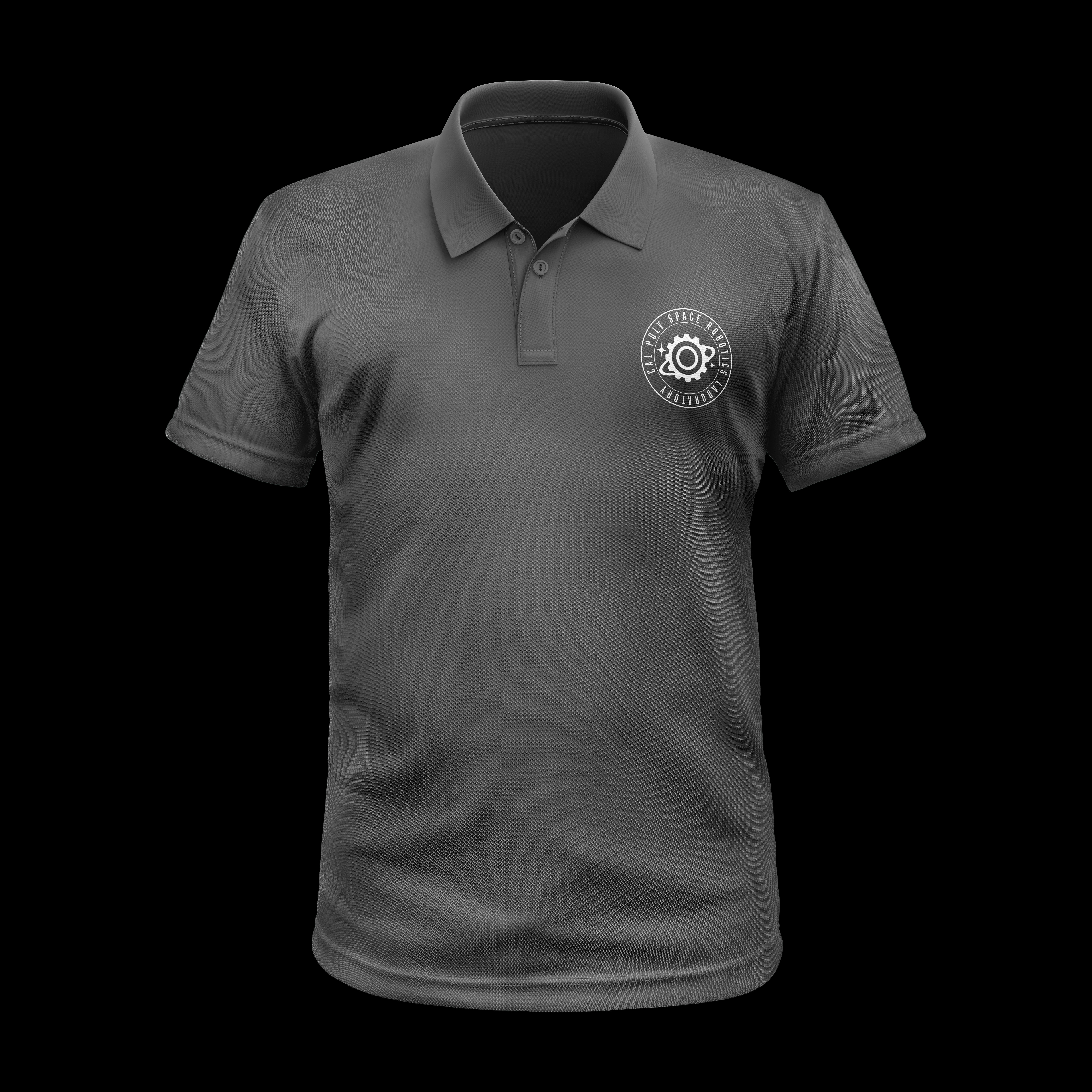
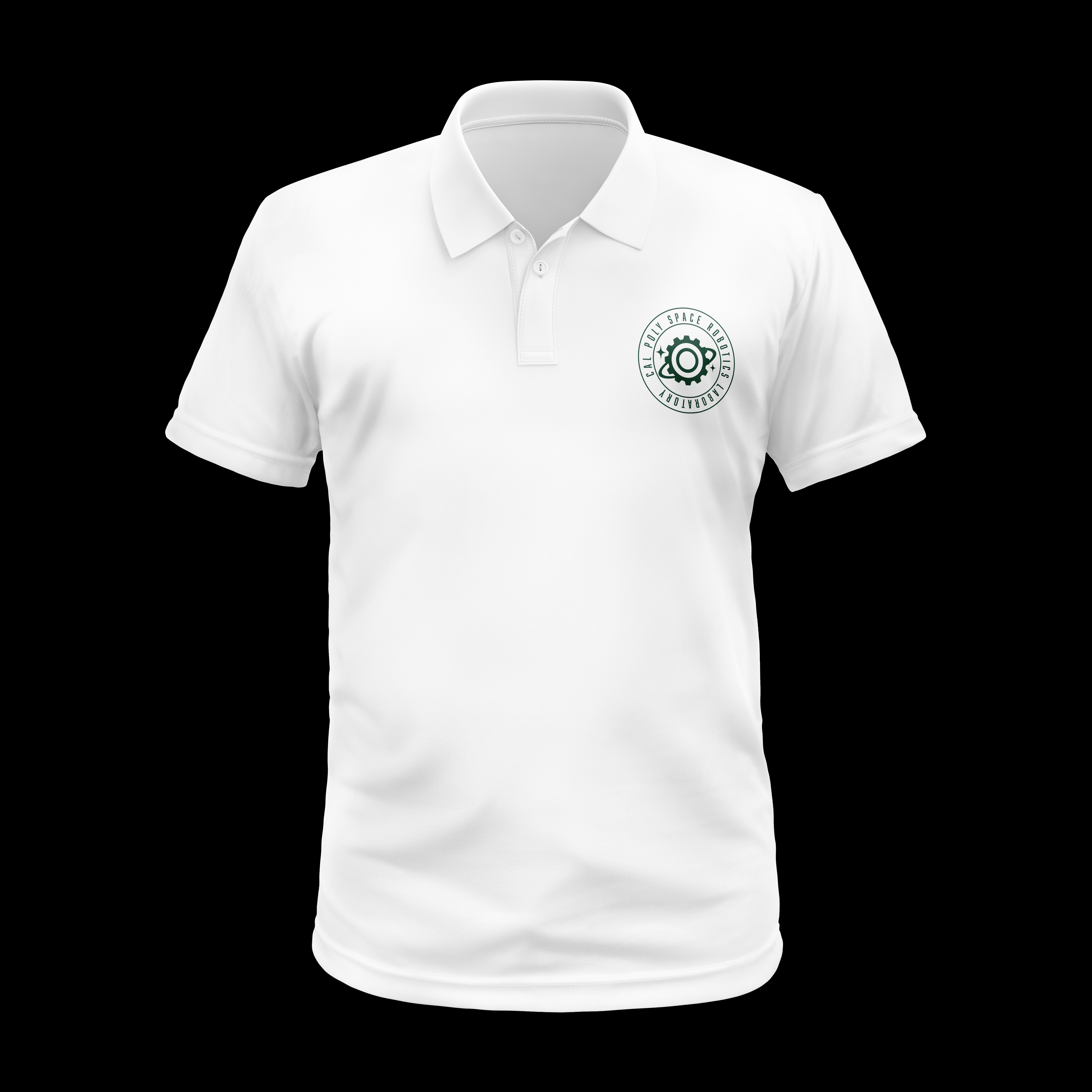
In May 2025, CPSRL approached me about establishing a logo that incorporated elements of both space and robotics, hence the name. After bi-weekly meetings discussing drafts, mid-point designs, and small yet important refinements, I finalized combining the gear and orbital rings, core symbols of the organization. By establishing the laboratory's visual identity, I utilized Adobe Photoshop to create multi-color mockups for the official CPSRL polo T-shirts. Eventually the Cal Poly Green was selected and finalized, and the CPSRL official polo has been worn by its members at presentations, conferences, and internships.

Process
The early design direction centered on Saturn's rings and space-forward imagery, but initial concepts read more like a national emblem than a laboratory identity. After feedback from the client and the CPSRL professor, I returned to the ideation phase with fresh eyes.
I started by free-sketching the first symbols that came to mind around the themes of space and robotics, then followed up with meetings to better understand the lab's specific activities and culture. This grounded the direction in something more authentic to the organization. From those sessions, a cleaner concept emerged: a gear and orbital ring combination that balanced the lab's two disciplines without overcomplicating the mark.


Testing the Mark Across Colorways
The simplified logo landed well with both the client and professor, earning quick approval to move into mockup production.
Before moving into full polo mockups, I explored the logo across four colorways to visualize how the logo would hold up on different backgrounds. This helped both myself and the client align on a color direction that felt true to Cal Poly's brand while translating cleanly onto an official garment.


Reflection
This project reinforced how important early client alignment is before committing to a visual direction. The pivot away from the initial concepts felt like a setback at first, but it pushed me toward a stronger, more considered solution. Designing for an official branded uniform also raised the stakes as well, the logo needed to hold up at a small scale, work across multiple colorways, and represent the lab in professional settings like conferences and internships. Seeing the final mark on the polo mockups confirmed that restraint and clarity were the right call.


