Role
Duration
Year
Location
For a Managing Quality in Graphic Communication course, I worked in a team to execute an Applied Quality Project to conduct a case study on Amazon's mobile app. Through a survey combining both qualitative and quantitative data, we identified key pain points: a lengthy search-to-purchase journey and poor visibility of seller credibility information. To address these, I redesigned a more streamlined interface using flow mapping, a fishbone diagram, the 5 Why's framework, and a House of Quality diagram before translating solutions into low-fidelity wireframes in Figma.
Problem & How Might We Statement
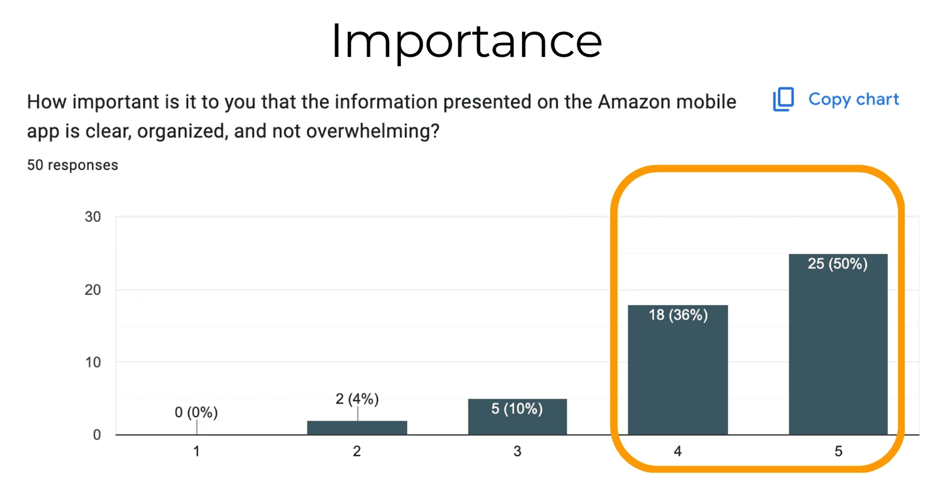
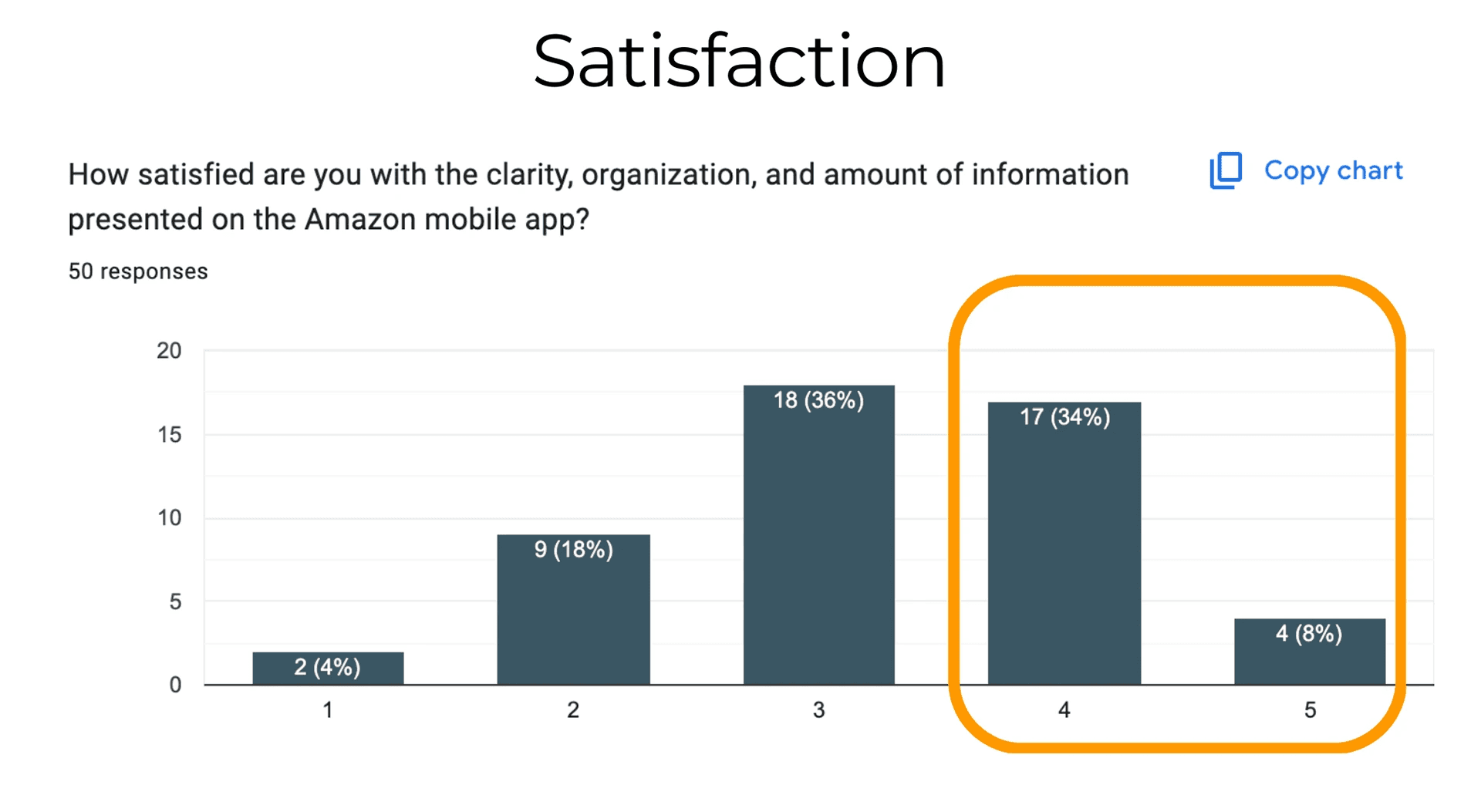
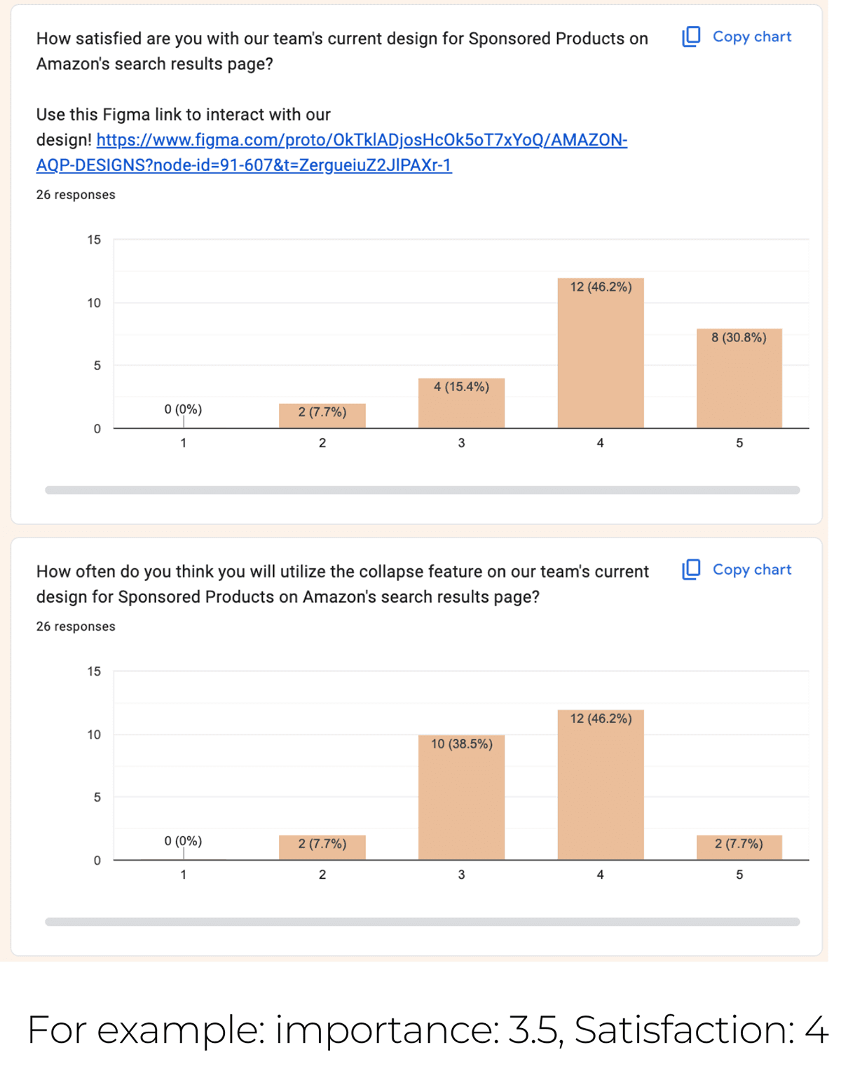
Amazon mobile users are frustrated by cluttered, disorganized product information that makes shopping difficult. While 86% of users say clearly presented information is important, only 42% are satisfied with the current experience, indicating a gap between user needs and the app's current design.
HOW MIGHT WE create a cleaner, more streamlined mobile experience for Amazon users by reducing visual clutter and unnecessary text so that they feel less overwhelmed and more satisfied when purchasing products?
Surveying
86% of surveyed Amazon users said that organized, clearly presented information was at least somewhat important to them. Despite this, only 42% of these users indicated they were satisfied with these metrics.
Our survey responders complained about having trouble navigating Amazon’s app, especially when attempting to search for specific items or compare multiple products. A more user-friendly design that reduces the user journey from the search to the purchase would be beneficial for the app.
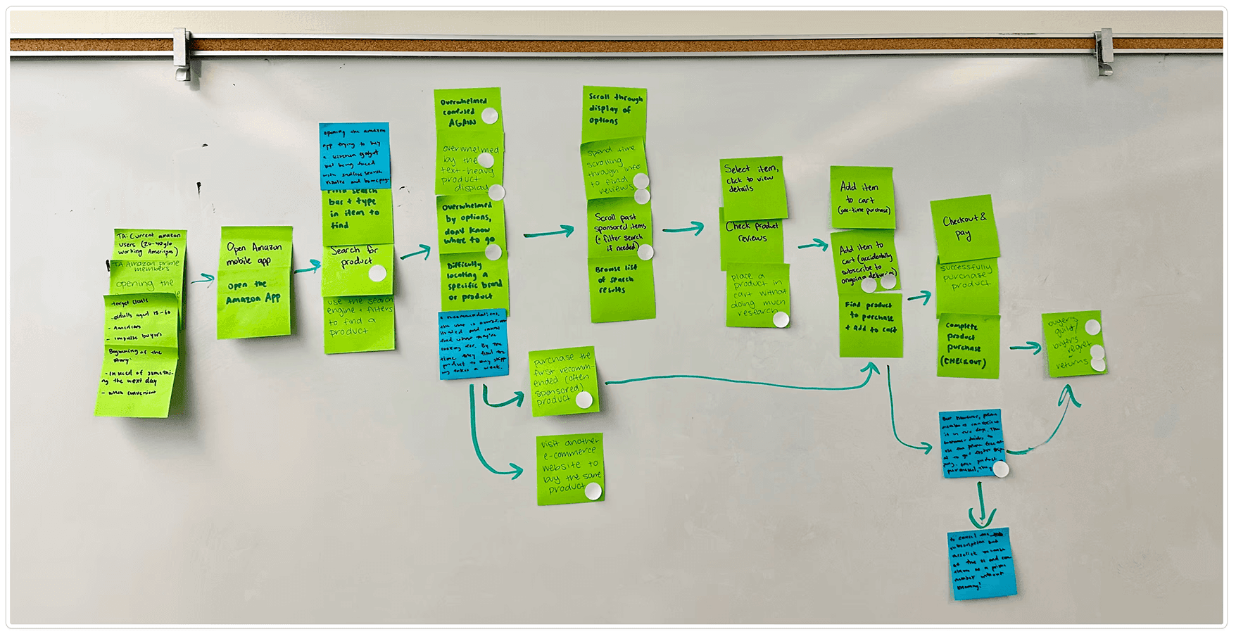
Flow Mapping
After analyzing the survey respondents, we used sticky notes to draft, easily rearrange, and vote to determine which screens were key to the user flow and thus needed to be prototyped through this project.
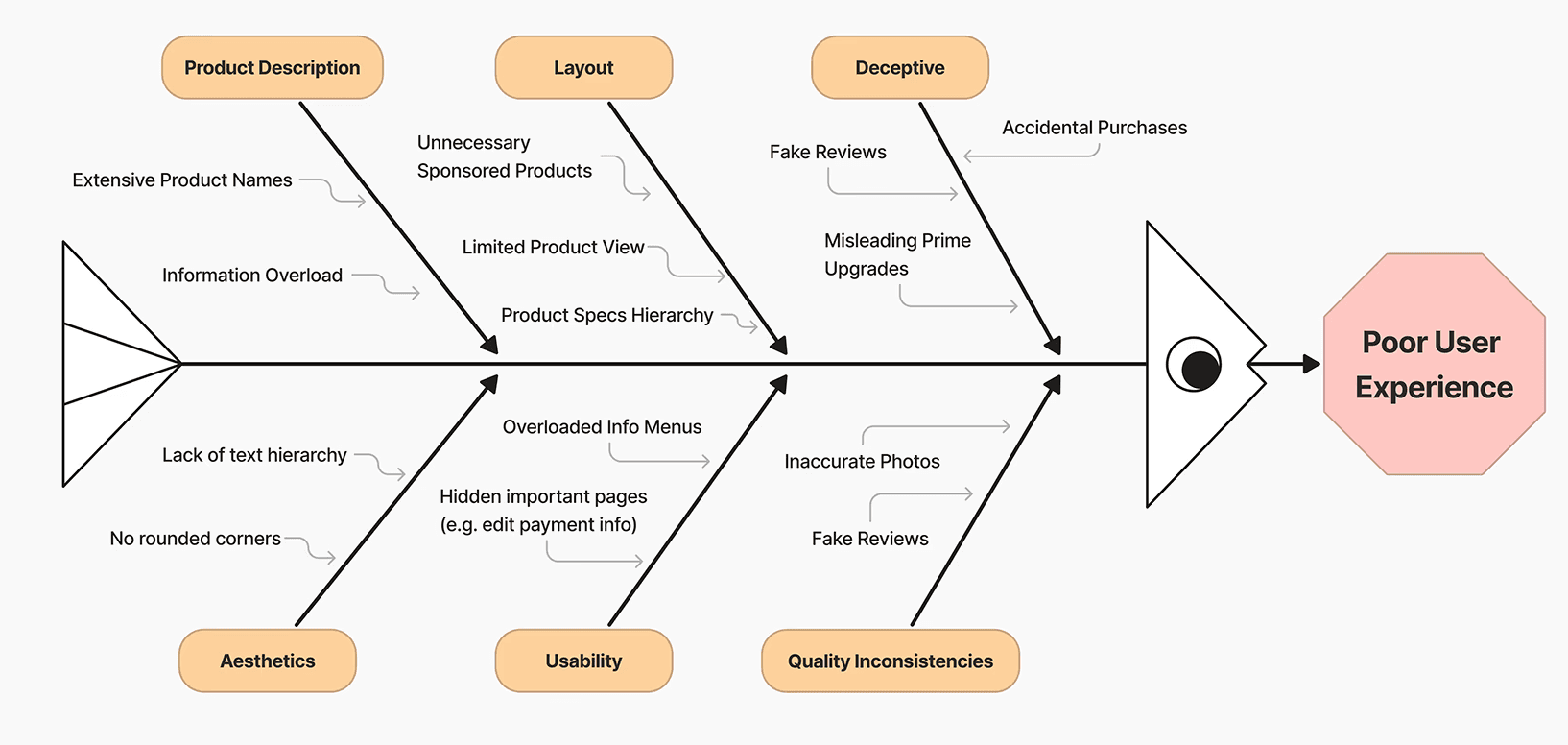
Fishbone Analysis
A fishbone diagram analysis organized the problems into 6 categories:
Product Description (information overload, extensive names)
Layout (unnecessary sponsored content, poor hierarchy)
Aesthetics (lack of text hierarchy, outdated design elements)
Usability (overloaded menus, hidden important pages)
Deceptive/Quality Inconsistencies (fake reviews, misleading upgrades, accidental purchases)
This analysis revealed that poor user experience stems from interconnected issues across information architecture, visual design, and trustworthiness, directing the design process to prioritize solutions that address the 44% satisfaction gap identified in user research.
Crazy 8 Sketches
Through time-constrained Crazy 8 sketches, this activity helped flush out any and all ideas we had in mind regarding how to redesign the Amazon mobile app. All of us collaborated to find similarities in our designs, crucial features in our sketches, and the goals in mind aesthetically.

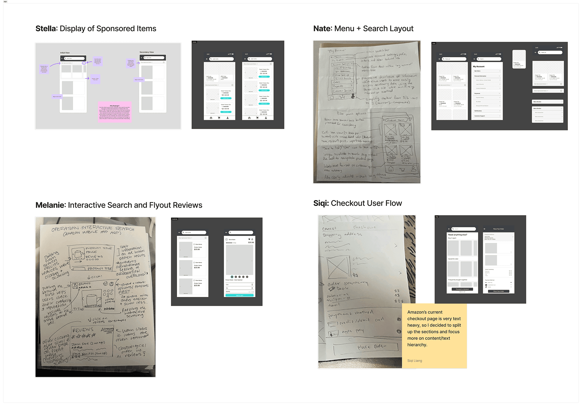
After sketching out ideas from our Crazy 8 activity, we used Figma to bring our designs from paper to digital. We each created our own individual low-fi designs that reflected our sketches, then we combined everyone’s innovations.
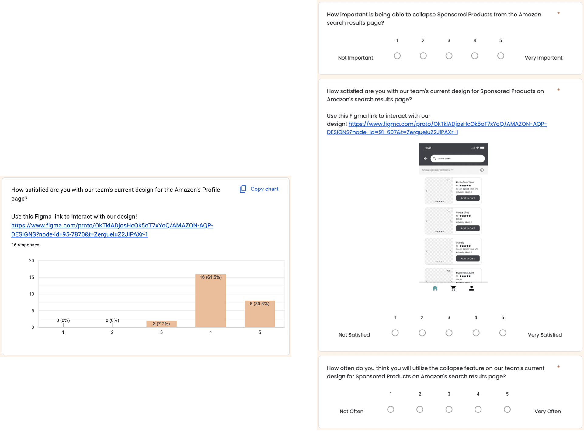
Secondary Survey
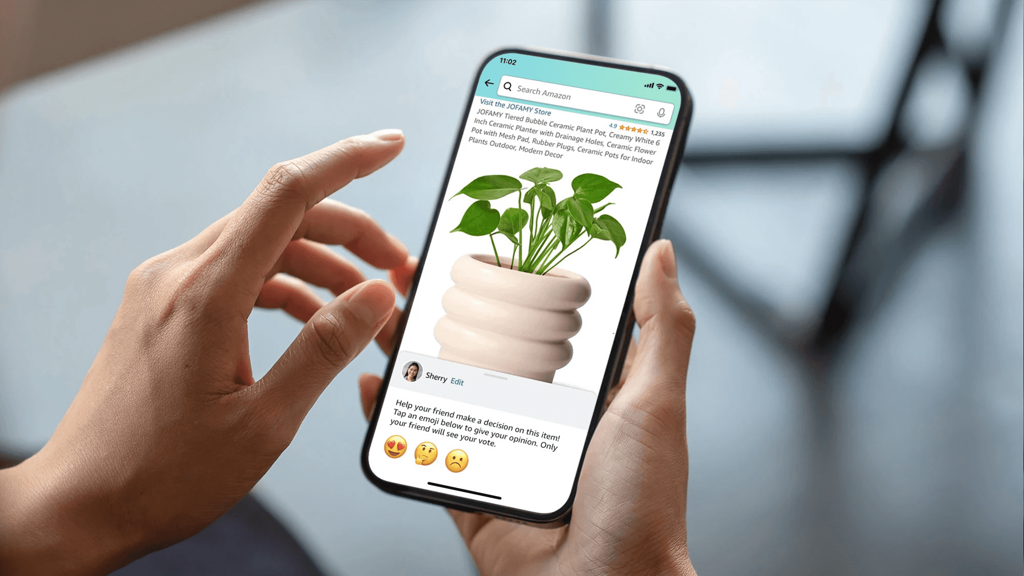
While including the low-fi prototypes along with images of each of our redesigned screens, this distanced experiment helped gather updated information needed to refine designs and visualize how users’ perceptions shifted. For all design changes, users were more satisfied than they were originally.
Users found some features to be less useful than others but still had a positive impression. 69.2% of respondents indicated they have accidentally ordered something to the wrong address, retroactively validating our choice to highlight the delivery address
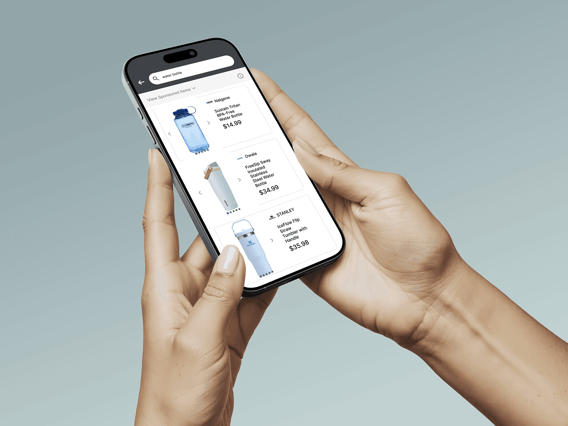
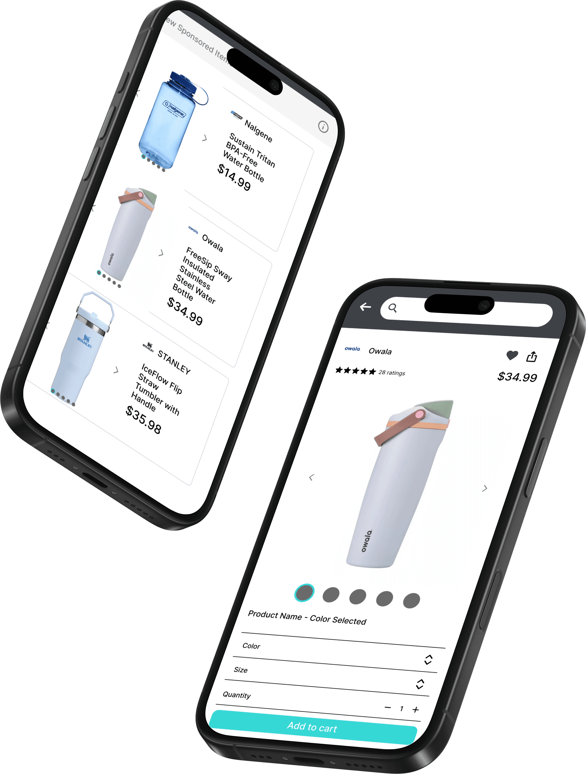
Final Low-Fidelity Wireframes
After receiving positive, improved responses from the secondary survey, we went back into Figma to polish the final low-fidelity wireframes for a redesigned Search Results page, Product Description page, Order Overview page, and Profile Menu.
I've also included mockup images with placeholder images to visualize the wireframes.


“Quality comes not from inspection, but from the improvement of the production process.”
― W. Edwards Deming, Out of the Crisis


